
Problem 1.
No stake change buttons immediately available & low stake changes. Users need to easily customise this based on wins and losses and increase stake with progress.
Problem 2.
As well as buttons and text falling outside of accessibility guidelines, we receive complaints in usability due to tight padding between the spin button and menu.
Problem 3.
Buttons disable for up to 5s to promote safer gambling with poor visibility of system status between spins. This presents as unresponsive UX and frustrating for players.
What the data showed


2023 | Entain
Throws: Expressing emotion & personality through universally recognisable interactions
Brand: Ladbrokes/Coral
Format: iOS, Android & Web
Timescales: 6+ months
My role: UX, IxD, Research
Scope: Greenfield feature
Date: 2024
Designing poker throwables. Objects you can throw to players to wish luck, express unhappiness / loss / disdain.

The problem
The challenge is to create animating items on screen where the parameters extend beyond placement and positioning, into time, trajectory and inertia. Developing and implementing this in a UX space was technically complex and required hands-on collaboration with developers.
The Solution
I defined start and end parameters and defined a system on Figma to help translate speed, rotation and positional indices easily. The result was defined interaction design which used the screen as a full canvas for exploration.
After Effects | Figma
Poker Spins
The problem
Most poker clients use slots machines to present this mechanic. We wanted to position ourselves away from this, but also present the other multiplier figures to increase anticipation of winning a large prize pool
The Solution
Using the facets of a hexagon you can see adjacent multiplier figures while keeping the winning facet highlighted and in view. The table colour was configured to correspond with winning prize pool. Adding a unique colour scheme each time you play.
Strategize ways of presenting a spins mechanic without relying on generic or typical representations
The problem
The challenge is to create animating items on screen where the parameters extend beyond placement and positioning, into time, trajectory and inertia. Developing and implementing this in a UX space was technically complex and required hands-on collaboration with developers.
The Solution
I defined start and end parameters and defined a system on Figma to help translate speed, rotation and positional indices easily. The result was defined interaction design which used the screen as a full canvas for exploration.
After Effects | Figma
Poker Spins
The problem
Most poker clients use slots machines to present this mechanic. We wanted to position ourselves away from this, but also present the other multiplier figures to increase anticipation of winning a large prize pool
The Solution
Using the facets of a hexagon you can see adjacent multiplier figures while keeping the winning facet highlighted and in view. The table colour was configured to correspond with winning prize pool. Adding a unique colour scheme each time you play.
Strategize ways of presenting a spins mechanic without relying on generic or typical representations
Before
After
There are several issues with the existing system. Usability is a key concern, with buttons that are too small and tightly padded, resulting in poor hit areas. Primary actions are also placed within a menu, which creates unnecessary friction when adjusting the stake. Additionally, there are no extra modes such as turbo or autoplay available for the US jurisdiction. The interface itself appears visually cluttered, with stacked text that looks messy and misaligned. Finally, there is duplication of text at the bottom of the screen across both the gameplay area and the UI bar, which adds to the overall lack of clarity.
Slots studios need a system of buttons to trigger broad gameplay functions. The spin button is the the most important button, along with stake change buttons. Our previous system, had many issues. The three below outline the problem our data shows.
The Problem
A strategic method of updating our throwables
Online poker lacks many of the social cues that make in-person play engaging and therefore most poker clients feature throwables to create engaging moments of interaction. Our existing client featured 22 throwables, many unused and out of date.
The Solution
Auditing and designing a collection of throws
I tested and gathered data to audit which ones were performing and introduced exclusive throws unique to our client. I adjusted priority and suggesting fewer interactions but better quality moments. The throws utilised the full client window and interacted with components on screen, uplifting our existing set substantially. Every interaction was designed with craft and attention to detail in mind.
Problem 1.
No stake change buttons, resulting in low stake changes. Users need to easily customise this based on wins and losses and increase stake with progress.
Problem 2.
As well as buttons and text falling outside of accessibility guidelines, we receive complaints in usability due to tight padding between the spin button and menu.
Problem 3.
Buttons disable for up to 5s to promote safer gambling with poor visibility of system status between spins. This presents as unresponsive UX and frustrating for players.
_gif.gif)
The Solution
The project delivered measurable improvements across both the product and the wider business. We saw a significant increase in stake changes, described by our Head of Studio Performance as a "mega increase" alongside richer correlation data that provided better insight into game release performance. The work also strengthened stakeholder relationships and improved overall brand perception, increasing confidence in the product and the team delivering it.


The results
The solution presented was a more radical UX redesign. A dedicated toolbar was created to house the buttons and maximise space within the bottom bar. I designed the UI with gamification in mind, and with contrast to compete with the saturated aesthetic of slots games. Various states were designed, along with interaction motion design to improve visibility of system status. The solution had balanced various benefits.
The problem
The challenge is to create animating items on screen where the parameters extend beyond placement and positioning, into time, trajectory and inertia. Developing and implementing this in a UX space was technically complex and required hands-on collaboration with developers.
The Solution
I defined start and end parameters and defined a system on Figma to help translate speed, rotation and positional indices easily. The result was defined interaction design which used the screen as a full canvas for exploration.
After Effects | Figma
Poker Spins
The problem
Most poker clients use slots machines to present this mechanic. We wanted to position ourselves away from this, but also present the other multiplier figures to increase anticipation of winning a large prize pool
The Solution
Using the facets of a hexagon you can see adjacent multiplier figures while keeping the winning facet highlighted and in view. The table colour was configured to correspond with winning prize pool. Adding a unique colour scheme each time you play.
Strategize ways of presenting a spins mechanic without relying on generic or typical representations



Screen as canvas
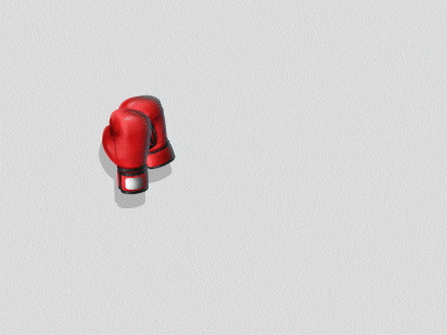
Rather than confining animations to a small overlay, I explored a system that treated the entire screen as a canvas. Throwables could interact with UI elements, travel across the full viewport, and use the screen edges to create playful, physics-inspired moments, resulting in more expressive, immersive interactions that felt integrated into the game.

Scalable and adaptable to various jurisdictions, regulatory laws.
The solution establishes a clear button hierarchy, with all buttons approximately 50% larger than in the current system, and the spin button uniquely placed within a circular container to distinguish it as the primary action. The design introduces clear button states, using red to indicate active status. Stake adjustment buttons are positioned close to the bet amount for improved usability, and the layout maintains visual balance even when certain buttons are removed due to legal requirements. Additionally, the bar is designed to be scalable, adapting its width across different device sizes.
Evaluation and trade-offs
Disadvantages of the system
This solution also has drawbacks, including a heavier implementation effort and a more fixed structure limited to a maximum of four buttons, which could present challenges for future product growth and expansion, although this is somewhat mitigated by the product lifecycle considerations.


Data
Auditing the popularity of each throw
Usage data showed that certain throwables were significantly more popular than others, prompting A/B testing to identify interactions that could potentially be retired. I also reviewed the relevance of the "Leprechaun" throwable, which has traditionally been portrayed as drunk in poker clients. After consulting the relevant audience group, we found that while the cultural reference remained well received, the portrayal itself felt outdated leading us to explore a more contemporary direction.
Implementation
Defining the technical framework for dev handoff
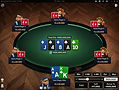
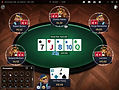
I defined the interaction framework for every throwable, including its origin and destination, player targeting behaviour, and the hover and selection states that guide users before triggering the action. Each interaction needed to feel clear, responsive, and consistent while supporting a wide range of animations. Some throwables presented greater technical challenges than others, so I worked closely within engineering constraints to find creative implementation approaches that minimised development effort.
End-to-end process
